Showing posts with label Typeface. Show all posts
COCO - A typefamily designed by Hendrick Rolandez 2012
by R27 CREATIVELAB on Thursday, 18 October 2012
Coco is a sans-serif typefamily declined in a set of 8 fonts with regular, italic, bold, bold-italic, condensed, condensed-italic, condensed bold & condensed bold-italic which can be used for several type of projects from digital to print. Each font has more than 209 glyphs including small letters, capitals, numbers & special glyphs and punctuation. This family is for all type lovers who would like to emphasize a fashion project. So Feel free to use it, share it and create amazing piece of works as you are directors, designers, photographers or models.
It is totally FREE meaning you have nothing to pay to use it and commercial works using this typefamily are authorized... and truly recommended.—
All photos used belong to their respective owners and/or fashion brands.
Download here: COCO-Free-Fashion-Typefamily


- Leave your comment • Category: Design Resource, Fonts, Freebies, Typeface, Typography
- Share on Twitter, Facebook, Delicious, Digg, Reddit

Here you can see the amazing process of how the people of LoSiento buid up this amazing 4D typeface.
Here you can see the amazing process of how the people of LoSiento built this amazing 4D typeface.
Talking Type - About Type Navigator: The Independent Foundries Handbook
by R27 CREATIVELAB on Friday, 20 July 2012
Gestalten.tv met a true "Type Writer" and typography expert to find out more about the "GPS for fonts." Alongside Martin Lorenz and Lupi Ascensio of TwoPoints.Net, Jan Middendorp edited Type Navigator: The Independent Foundries Handbook, the essential overview of the modern typefaces currently available and the innovative people and companies behind them. Hear him talk about the need for a substantial guide within the ever growing landscape of typography and the current popularity of typefaces and fonts within the design community.
- Leave your comment • Category: Design Tools, Graphic Design, Typeface, Typographer, Typography
- Share on Twitter, Facebook, Delicious, Digg, Reddit
The development of the signage typeface Wayfinding Sans Pro by Ralf Herrmann
by R27 CREATIVELAB on Thursday, 19 April 2012
A typeface on a sign that is read from 300 yards has different requirements than a typeface read in a magazine, from your armchair. And even if the typefaces are designed specifically for signage, they are often a local solution that just doesn’t work everywhere. For example, the Transport typeface used in the U.K. is a very good and legible design, but it is designed for English words and names and is far too wide for the generally longer names of German cities. Another example is the Clearview typeface with its extreme x-height, which works on American road signs, but not so well for languages using numerous diacritical marks. So in the end, for every typeface I checked and tested, I discovered both advantages and disadvantages. There was not a single typeface that I could recommend for signage in every situation.
Source: ilovetypography.com


- Leave your comment • Category: Design Resource, Signage, Typeface, Typography
- Share on Twitter, Facebook, Delicious, Digg, Reddit
A Brain-Breaking Typeface Where Every Letter Is An Optical Illusion


- Leave your comment • Category: Inspiration, Typeface, Typography
- Share on Twitter, Facebook, Delicious, Digg, Reddit


Original Tweet:
Free Typeface "Beaver" : behance.net/gallery/BEAVER… #free #font #typography
— #typography (@typographyEcho) January 22, 2012
Sent via TweetDeck (www.tweetdeck.com)
- Leave your comment • Category: Design Resource, Fonts, Freebies, Typeface
- Share on Twitter, Facebook, Delicious, Digg, Reddit
Aria – a typeface.
fountaintype.com/
The inspiration for this typeface came from the epigraph on a frame of a nineteenth century painting. I was fascinated by the peculiar capitals of the inscription. The high contrast, and the overall quirkiness, especially the tail of the R and the oblique stems on the M, was interesting.
I decided to draw a display font with high contrast and a vertical axis, in a reference to the transitional form. Still I wanted to capture the spirit of the original letters, which to me are so imbued with Romanticism. This approach allowed for some exuberance on the regular style, but also led to more calligraphic letterforms in the italic – in which "the flow of the curves" lead the way.
Typeface design: Rui Abreu
Movie trailer: Rui Abreu
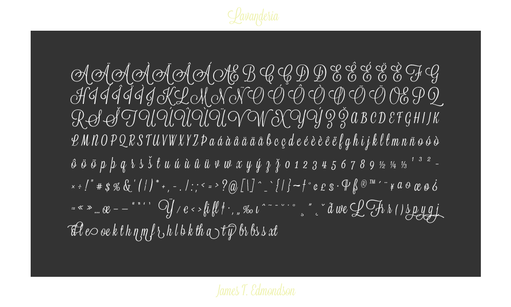
Based on lettering found on Laundromat windows of San Francisco's Mission District, Lavanderia features numerous opentype features and three weights.
- Leave your comment • Category: Design Resource, Fonts, Freebies, Typeface
- Share on Twitter, Facebook, Delicious, Digg, Reddit

- Leave your comment • Category: Infographics, Inspiration, Posters, Typeface
- Share on Twitter, Facebook, Delicious, Digg, Reddit

Limited time pre-order for the 2011 holiday!
Place your order by December 5th, shirts begin shipping on December 12th.
Make an emphatic statement about type.
Designed by Khoi Vinh of Subtraction.com and Mixel.
We've screened his one-of-a-kind design with two colors on a 100% cotton, asphalt, American Apparel Model No. 2001 shirt. Sizes available for the ladies and the men.
Lettering: A Reference Manual of Techniques by Andrew Haslam
by R27 CREATIVELAB on Friday, 30 September 2011

- Leave your comment • Category: Books, Design Resource, Letters, Typeface, Typography
- Share on Twitter, Facebook, Delicious, Digg, Reddit

Etsy shop Vintage Marvels offers quite the selection of letter press wood blocks, from complete alpha bets to sets that are grouped by let ter to short words. Check them out...
- Leave your comment • Category: Letterpress, Resource, Retro, Typeface, Typography
- Share on Twitter, Facebook, Delicious, Digg, Reddit

Etsy shop Vintage Marvels offers quite the selection of letter press wood blocks, from complete alpha bets to sets that are grouped by let ter to short words. Check them out...
- Leave your comment • Category: Letterpress, Resource, Retro, Typeface, Typography
- Share on Twitter, Facebook, Delicious, Digg, Reddit

Etsy shop Vintage Marvels offers quite the selection of letter press wood blocks, from complete alpha bets to sets that are grouped by let ter to short words. Check them out...
- Leave your comment • Category: Letterpress, Resource, Retro, Typeface, Typography
- Share on Twitter, Facebook, Delicious, Digg, Reddit