The man who perfected Penguin's classic paperback deserves to be remembered as one of the great designers of the 20th century.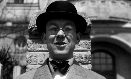
It is something of an understatement to say that typographer Jan Tschichold was confident of his own importance. On the occasion of his 70th birthday in 1972, he wrote his own tribute in the third person. It began: "Two men stand out as the most powerful influences on 20th-century typography: Stanley Morison, who died in 1967, and Jan Tschichold."
Morison, begetter of the Times typeface amongst many others, is now largely hidden in history. Tschichold, however, has recently come to fresh prominence. An avant-garde German typographer in the 1920s, Tschichold is most remembered in Britain for his postwar refashioning of Penguin paperbacks, with their famous, horizontally banded covers – orange for fiction, green for crime, blue for biography. Celebrations of the publisher's 60th anniversary in 2005 helped bring him out of the circle of professional and academic admirers to a much wider audience. Since then three books have appeared, and now comes a coffee-table tome from Thames & Hudson.
Tschichold was born in 1902. The son of a signwriter, his first career was as a calligrapher for advertisements. His home town of Leipzig was the centre of the German book trade, and the young Jan was naturally drawn into the world of print. But he'd also heard about the new "-isms" in art, and was curious. Constructivism was on view not far away in Weimar, when the Bauhaus opened its doors for a public exhibition in 1923. Founded by the architect Walter Gropius as a school of arts and crafts in 1919, Bauhaus staff included well-known artists such as Paul Klee and Wassily Kandinsky. Abstract art of the kind imported from Mondrian and the Dutch De Stijl movement, and in particular the ideas of the Russian Constructivists, influenced Gropius to expand the aims of the Bauhaus, embodied in the slogan "art and technology, a new unity". In the exhibition catalogue, itself a kind of manifesto, the Hungarian artist-designer-photographer Moholy-Nagy pronounced that "typography is communication through print" – in other words, that a message should not be forced into a preconceived aesthetic.
Tschichold came away from the Bauhaus exhibition "in a state of great agitation", as he remembered in his 1972 testament. Soon he was the chief propagandist for the new movement in typography, crossing Europe for lectures, and after a spell in Berlin – the centre of the trans-European avant-garde – his first major work, The New Typography, was published in 1928.
In the words of his subscription leaflet, Tschichold was connecting the new typography to the "total complex of contemporary life". Its title borrowed from Moholy-Nagy, the book set out a series of stern foundational principles for good design: the use of sans-serif fonts, standardised paper sizes, photographs rather than drawn illustrations, asymmetrical rather than centred layouts. Partly as a result of Mondrian's influence, abstract art came to play a large part in Tschichold's work. He used geometrical elements and diagonal arrangements, not only in everyday jobbing printing – business cards, letterheads and brochures – but also in a series of cinema posters. Rarely in more than two colours, these designs incorporate small half-tone photographs, never rectangular, but cut-out as circles or silhouettes. The text, often hand-drawn, was always sans-serif.
Not everyone was impressed: the Nazi party remained deeply suspicious of modernism, regarding it as fundamentally "un-German", and after Tschichold took up a teaching post in Munich at the behest of Paul Renner (best-known for his design of the modernist typeface Futura), both he and Tschichold were denounced as "cultural Bolshevists". Only 10 days after the Nazis surged to power in March 1933, Tschichold was taken into "protective custody". The authorities had made it clear that progressive ideas would not be tolerated.
After four weeks in prison, and with no prospect of work in Germany, Tschichold and his family soon took refuge in Switzerland, leaving in August 1933, thanks to a sympathetic German policeman who helped him get a passport. The transition does not appear to have been difficult: with an established reputation and connections with the School of Arts and Crafts in Basel, Tschichold was soon teaching, designing posters, curating exhibitions and writing on typographic practice and history.
Tschichold's relationship with England began before 1935, when he visited London for the first time for an exhibition of his work. Since 1928, in a series of articles in trade magazines, he had given British printers an insight into the continental avant-garde, explaining the New Typography, Russian Constructivism, photomontage, and the work of Moholy-Nagy – himself now working as a freelancer in London. Encouraged by Moholy's success, Tshichold was anxious to find work in England too.
It helped that since leaving Germany books had become Tschichold's chief interest: and, as luck would have it, in 1946 the founder of Penguin Books, Allen Lane, was looking for someone to professionalise the company's design and production. Founded 11 years before, Penguin had transformed the economics of British publishing by selling (as the slogan had it) "good books cheap" – three million copies at sixpence in the first year alone – making high culture available to the mass public at a lower cost than ever before. But cheap did not mean shoddy, and Lane urgently wanted to improve the quality of his output. After consulting one of England's typographer-printers, Oliver Simon, a German-speaking admirer, Lane and Simon went to meet Tschichold in Basel. In March 1947, Penguin had a new designer.
Allen Lane noted that "nothing compared to storm when Jan Tschichold arrived. Mild-mannered man with an inflexible character. Screams heard from Edinburgh to Ipswich and from Aylesbury to Bungay." This was the result of Tschichold's immediate effort to raise the standard of undisciplined English typesetting; to his frustration, Tschichold found himself obliged to treat the compositor not as a craftsman but as a machine, by specifying precise measurements for the spaces between each combination of letters in a title. It was the only way to get the results he desired.
As well as demanding more from his printers, Tschichold tidied up the horizontally banded covers of the standard Penguins and refined the Penguin emblem. Each of these adjustments hardly changed what we now think of as the "classic" Penguin designs, but the effect was to set new standards for book production in England. To other special series, Tschichold brought a distinctive German tradition. The small hardback King Penguins followed the elegant format of the Insel books: the cover with white, bordered titling label centred on a colour or patterned background, the inside pages laid out with impeccable and traditionally detailed typography. This style, which he had already employed on similar books for the Basel publisher Birkhäuser, was repeated on music scores, the Reference Library series, on Penguin Handbooks and poetry titles.
Not everything was imported from Tschichold's experience on the continent. One English achievement that he respected was the quality of typeface designs available for machine typesetting. For the covers of the main series, Tschichold retained Eric Gill's elegant, clean fonts Gill Bold and Gill Sans. And the way a book opened, how comfortable it felt in the hand, were as much Tschichold's concern as the details of its typography. He considered the weight and grain-direction of paper, stiffness or flexibility of cover boards, and binding. After the wartime restrictions on paper were lifted, Tschichold was able to replace the greyish stock with something more cream-tinted. These reforms were made on a tight budget: the standard Penguin cost the equivalent of 15p. Tschichold was producing a quality product for very little money.
Each phase of Tschichold's career has had a lasting influence. The early work of uncompromising modernism which brought together different strands of the Modern movement has been much imitated for its bravura. The theoretical pronouncements of his early period in Switzerland – of how to space letters and words, of what typefaces to mix – are rules which are still followed. His examinations of book proportions and critical histories of lettering and typefaces, and the elegance of his book design, are on the shelves in advertising agencies and design studios. And his Penguin rules are now available, adjusted for the web. Perhaps his 70th birthday tribute was accurate after all.
SOURCE: Richard Hollis, guardian.co.uk, Friday 5 December 2008
- Leave your comment • Category: Graphic Design, Typography
- Share on Twitter, Facebook, Delicious, Digg, Reddit